Context
Designed for people in remote environments where water, food, medicine, and first-aid supplies may not be available through fixed infrastructure.
Case Study / Service Design / UI UX
A mobile supply system for remote exploration, designed around one simple loop: access essentials in the field, then review and complete payment later on mobile.
This project rethinks the vending machine as a lightweight service system for hikers, explorers, and travelers moving through environments where stable infrastructure cannot be assumed.
Overview
The project focuses on a two-touchpoint system. The kiosk handles urgent, in-field access to supplies, while the mobile interface supports later review and payment in a calmer context.
Designed for people in remote environments where water, food, medicine, and first-aid supplies may not be available through fixed infrastructure.
The main interaction happens on-site through a simple kiosk flow, while payment is intentionally deferred to a lightweight mobile companion.
A clearer service logic: immediate access at the station first, followed by post-trip review and payment on mobile.
Service Flow
The system reduces field interaction to only the most essential steps, then shifts administrative actions into the app after the trip.
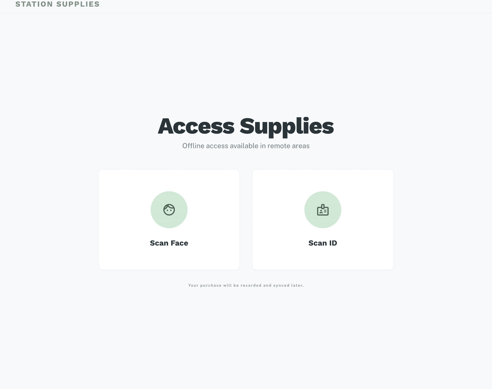
Authenticate at the station
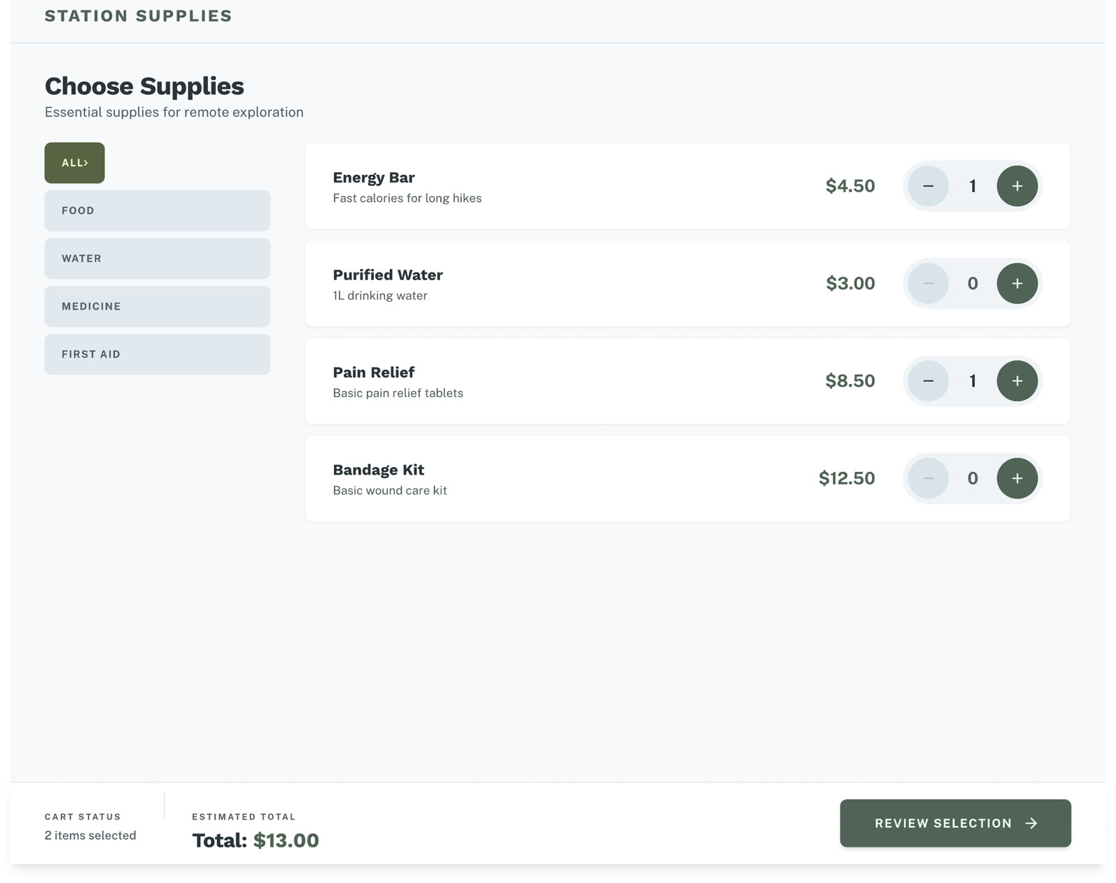
Select essential supplies
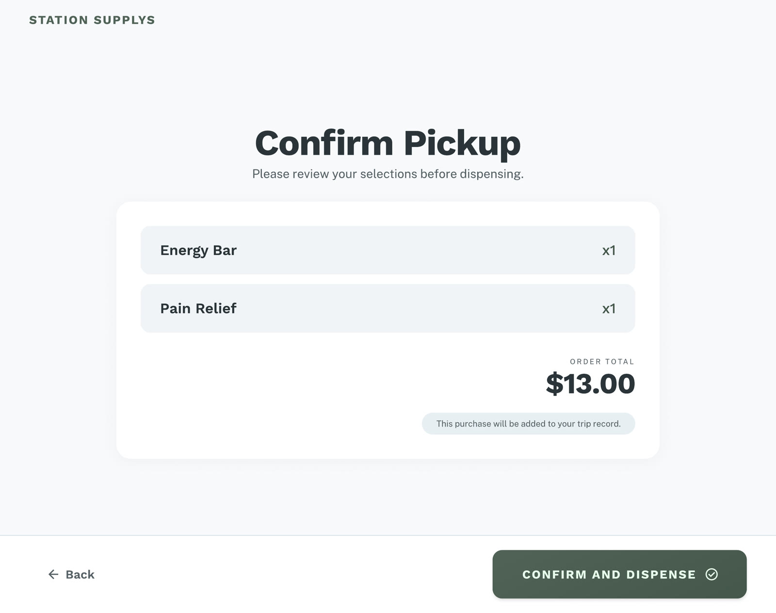
Confirm pickup
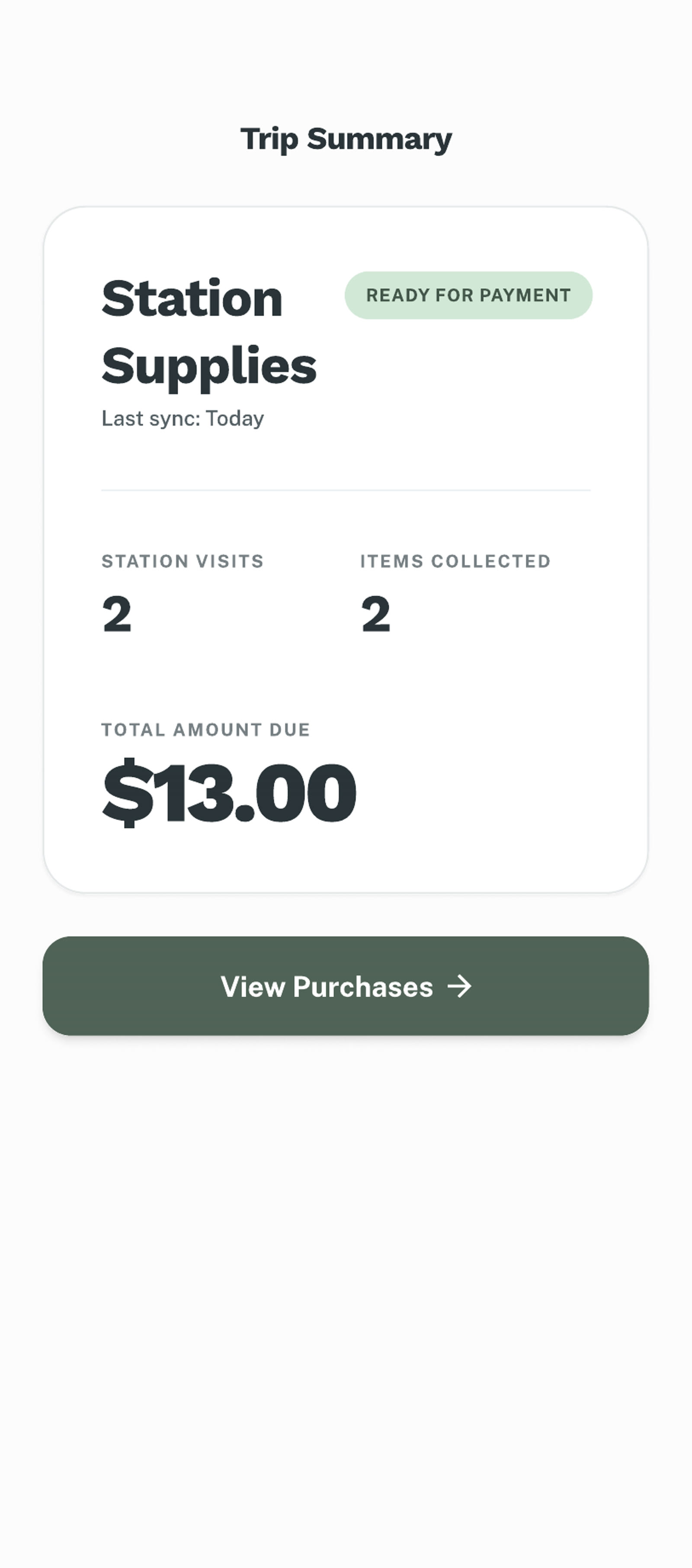
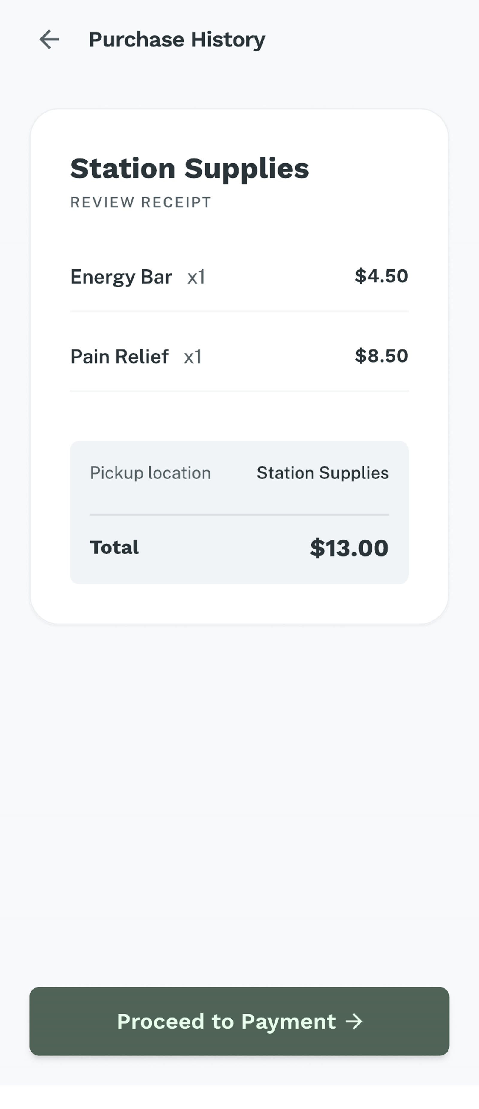
Review purchases later
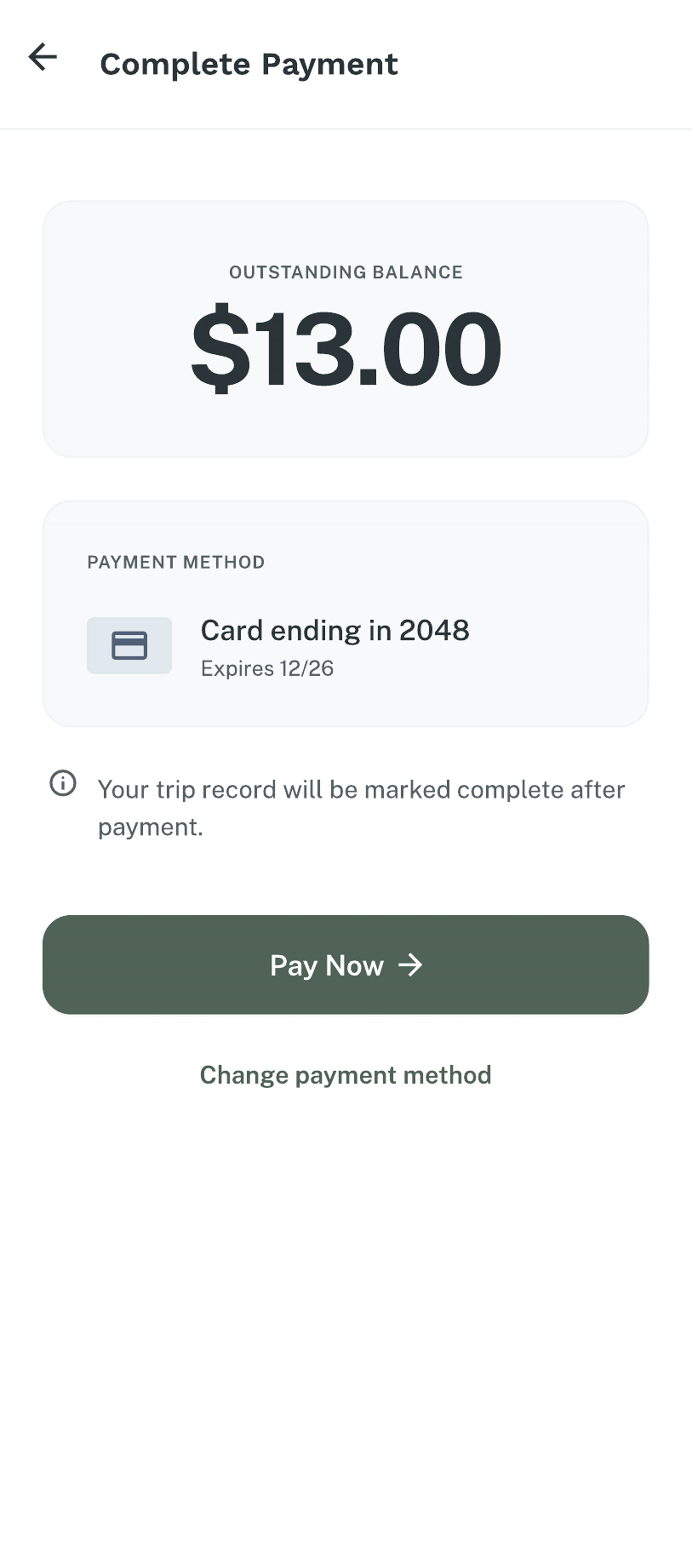
Complete payment in app
Primary Touchpoint
The vending machine is the primary touchpoint. It is designed to stay simple in the field: authenticate quickly, choose clearly, and confirm before dispensing.
Field interaction
The kiosk flow prioritizes large touch targets, direct navigation, and a reduced decision path so users can get what they need with minimal friction.
Secondary Touchpoint
The mobile interface is intentionally secondary. It only exists to review recorded purchases and complete payment after the trip, rather than interrupting the field experience.
Post-trip review
Instead of asking users to handle identity, purchase, and payment in one place, the system separates urgent access from administrative follow-up.
Reflection
The biggest improvement came from separating urgent access from later payment. Once the kiosk no longer tried to handle every part of the process, the system became easier to understand and easier to use.
This project reinforced an important lesson for me: service design is often less about adding more features, and more about deciding which actions belong to which touchpoint.
Designing for remote access means deciding what must happen now, and what can wait until later.